
Design Like a Pro: How to Use Hierarchy to Create Visually Stunning Graphics
Just a quick background of me (Mary Jacobs), I have a BA in Graphic Design from The Art Institute of Dallas. The school was fast-paced and I learned how to design and market products in the best possible way. Surprisingly, there’s a lot of rules to follow for good design, and these are the tips I’d like to share with you.
What is Design Hierarchy?
Well, it’s a design principal that refers to how elements are arranged in a design. The hierarchy helps designers lay out each element in a logical manner that helps the visual be digested properly.
This means, the header will be at the top with the largest font. Then everything after that is sized based on importance. It’ll help your audience better understand the flow, so they know where to look first.
1. Size Impacts Visibility
Bigger is better, right? While that’s still up for debate, size is arguably the most effective way to emphasize hierarchy. It’s the reason why newspaper headlines appear in larger font, and major stories often have even larger headlines than articles on the rest of the page. In any design, larger elements – whether they be words or images – not only will be most noticeable, but they also will carry the strongest message.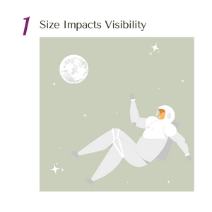
Without a headline pointing you in the right direction and you see the left example – What is the story about? Is it about the Moon or the Astronaut? It’s hard to know without making your main focus larger than the supporting element.
2. Perspective Creates an Illusion of Depth
By utilizing perspective, you can create an illusion of depth ranging from a few inches to several miles. Because we see similar illusions in the real world, we generally perceive larger objects as being closer than similar small objects, and, therefore, they usually command attention before any other object on a page.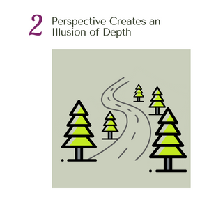
In a bird’s eye view, a group of trees could look like dots on a page. You don’t realize until the perspective has changed, and it is revealed to be the trees at an incline.
3. Color and Contrast Draw Attention
Just as larger elements are perceived as more important than smaller elements, bright colors usually draw greater attention than duller hues. For example, if a single element in a block of hearts is highlighted with a bright color, it immediately grabs readers’ attention. 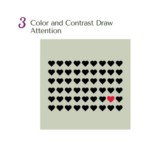
Color combinations used in a design and how they relate to one another, are known as a color scheme. It can create unity, harmony, rhythm, and balance within a creation, but it can also create contrast and emphasis.
4. Fonts Organize Design
Think about a business card. Generally, each is comprised of several sizes of type, with major headings in a larger point size than other bits of information. Typeface hierarchies can be created with various sizes, weights and spacing. Even if a single font is used throughout a design, varying its size and weight not only draws attention to more important elements, but creates an overall composition that is easy to read and understand.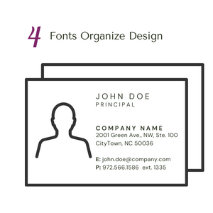
5. Space provides Emphasis and Movement
According to the Rule of Space, an aesthetically pleasing design requires its fair share of clutter-free negative space. It’s usually referred to as “white space,” regardless of the actual background color. Strategic spacing can even draw viewers’ eye across the page in a targeted sequence, by contributing to page-scanning patterns.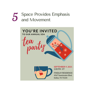
Readers tend to scan pages based on patterns, observable through their eye movements. When you want your audiences to notice elements in a particular order, you often rely on the most common patterns – reading from left to right. So in the example, I’ve left white space for enough text to complete a tea party invite in the “Z-Scanning Pattern”
6. Proximity Suggest Relationships
Proximity, or where elements appear in relation to one another, is one of the most basic elements of composition. Simply speaking, placing related elements close together suggests to readers that they are, in fact, related.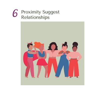
In my example, I’m starting with images of women powering together. If I want to get my point across of unity or togetherness, I want all of them to stand closely. If I left one all by its lonesome, it’ll be confusing to my reader.
7. Negative Space Emphasizes
Just as grouping items near each other suggests their relation, including white space around elements singles them out as separate groups of information. Negative, empty space not only makes information easier for readers to digest by grouping it into compartments, but it also creates focus as it helps eyes zero in on individual items.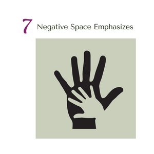
Compositions lacking ample negative space can result in a jumbled, confusing and chaotic design. Less is more. You can even utilize the blank space to suggest an additional visual message. Like adding the heart in the larger hand.
8. Alignment Directs Eyes
Alignment is part of the structure by which elements are placed in a design. It dictates that visual components, whether they be text or images, are not positioned arbitrarily throughout a composition. Many visual designs are centered or justified, which means they are spaced across a page, so they share both left and right margins. If words were just scattered randomly across a page in every direction, they would create quite the confusing scenario.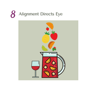
In the Sangria example, it’s easier to follow the fruit dropping straight into the pitcher, rather than it being spaced out. Your eyes might stretch over to the glass, which isn’t our main focus.
9. Odd-Numbered Groups Create Focus
The Rule of Odds allow you to emphasize a particular image by placing them in the center of a group. When you place an equal number of neighboring objects on either side of the focal point, you’re creating an Odd Numbered Group. The result will point to the most important visual element, located in the center. Groups consisting of an off number are almost always considered more interesting and aesthetically pleasing than even numbered groups. Why?? People feel more comfortable with balance.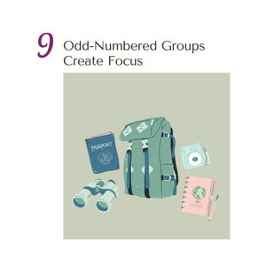
10. Repetition Unifies a Composition
Just as contrast emphasizes and draws attention to design elements, repetition creates unity, which boosts understanding and recognition. Whether it’s a font, color, shape, or size of an element, consistency helps define your hierarchy.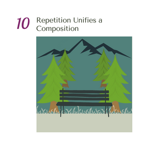
In the example, you get a much clearer design when you have equal repetition. This also includes our last tip with the bench being the odd number in the middle and the trees balancing it out.
11. Lines Suggest Movement
Movement is one of the most effective ways to attract viewers’ attention, especially when it’s implied within a still design. Lines are obviously efficient in pointing to items of emphasis – like an arrow – but they don’t have to physically appear on the page to do the trick. For example, by slanting an object up or down, lines can be created that suggest flight or descent.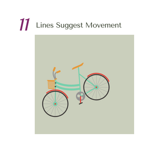
12. Grids Organize a Design
The most effective designs are composed through some type of grid. Artists, photographers and graphic designers have long employed the rule of thirds to improve the overall balance of their compositions. The rule involves mentally dividing your composition into a grid composed of two horizontal and two vertical lines (or 9 equal boxes) and then using only two thirds of the space. Using this photo, for example, you’re getting a lot more out of it when you take up two thirds of the space for the subject. That also works for the background – where the water is two thirds horizontally, and the mountains are just starting at the one third mark. Don’t get me wrong, there is a moment when you want your subject to be dead center, but it’s always more appealing when it isn’t.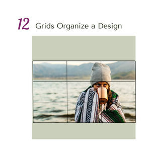
There’s a lot of tips to think about when designing your next Chapter flyer, but if you start simple and pick out 2 or 3 tips that’ll work best for you, then you’ll be making amazing looking designs in no time.
Thank you!


